Meta ads safe zones are designated areas within your ad creative where text, logos, and CTAs must be placed to avoid being obscured by platform UI elements like buttons, profile icons, and interactive overlays. For Stories, keep content away from the top 14% (270px) and bottom 20% (380px). For Reels, the bottom safe zone increases to 35% (670px) due to additional interactive elements. Using Meta's Safe Zone Guardrail in Ads Manager helps verify placement before launching campaigns.
You spend hours designing the perfect ad. The headline is punchy, the CTA is bold, and the visuals are on point. Then you launch, and Meta's "Shop Now" button lands directly on top of your carefully crafted message.
This happens constantly. UI overlays crop your text, hide your CTAs, and waste your ad spend on creative that viewers can't fully see. The fix isn't complicated, but it requires understanding exactly where Meta places its interface elements across different placements.
This guide gives you the complete safe zone dimensions for every Meta ad placement, explains the critical difference between Stories and Reels (most advertisers get this wrong), and shows you how to verify safe zones before launching. If you're testing creative at scale in the Andromeda era, getting safe zones right on every variation matters more than ever.
What Are Meta Ads Safe Zones?
Safe zones are the areas within your ad creative where critical content, text, logos, CTAs, won't be obscured by platform UI elements. When your ad runs on Facebook or Instagram, Meta overlays interface elements like profile icons, like buttons, share icons, captions, and CTA buttons on top of your creative.
If your headline or logo sits underneath those elements, viewers never see it.
The challenge is that each placement has different overlays. A feed ad has minimal UI interference. A Reels ad has likes, comments, share buttons, captions, and audio information stacked on the right side and bottom. Stories have profile icons at the top and swipe-up prompts at the bottom.
Designing one creative and expecting it to work everywhere without considering these differences is how ads fail silently, burning budget on impressions where your message is partially hidden.
Why Safe Zones Matter for Ad Performance
The Real Cost of Ignoring Safe Zones
When your CTA gets covered by Meta's "Shop Now" button, you're paying for impressions that can't convert. When your logo is hidden behind a profile icon, you're wasting brand impressions. When your headline is truncated by caption overlays, your message becomes unclear.
These aren't edge cases. Run any 9:16 vertical ad without considering safe zones and you'll likely have content obscured on at least one placement.
The math is simple: if 20% of your creative's key message is hidden on 40% of your placements, you're effectively paying full price for diminished impact.
How Safe Zones Impact Creative Testing
In the current Meta advertising landscape, creative diversity drives performance. The advertisers winning aren't using secret targeting hacks. They're testing massive amounts of creative variations and letting Meta's AI find the winners.
But more variations means more opportunities for safe zone mistakes. If you're launching 50 creative variations and half of them have CTAs in the danger zone, you're undermining your own test before it starts.
Getting safe zones right at the template level, before you scale, prevents this problem entirely.
Complete Safe Zone Dimensions by Placement
Here's the complete reference for every major Meta ad placement. Bookmark this section.
Feed Ads (1:1 Square)
Dimensions: 1080×1080px
Safe zone: Keep all critical content within the center 80%, approximately 100px from all edges.
Feed ads have the least UI interference. Meta displays your image or video with minimal overlay. The main risk is edge cropping on some devices, so keeping text and logos away from the very edges ensures consistent display.
Key placement: Center your most important message in the middle quadrant.
Feed Ads (4:5 Vertical)
Dimensions: 1080×1350px
Safe zone: Leave 250px margin at top and bottom.
The 4:5 format dominates mobile feeds because it takes up more screen real estate than square. The extra vertical space means more room for your message, but also more area near the edges that might get cropped on certain devices.
Best for: Mobile feed dominance with maximum visible creative space.
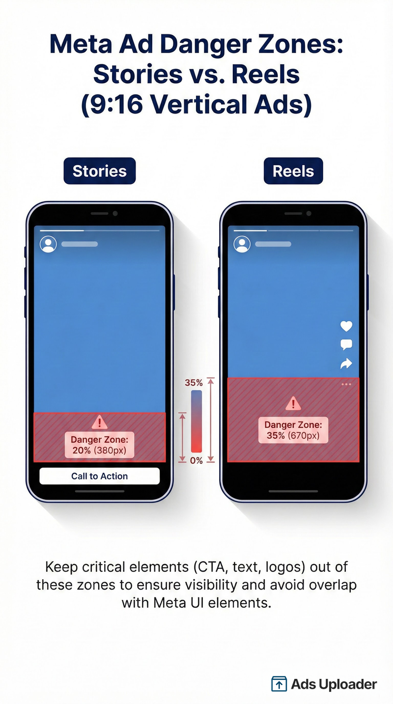
Stories (9:16 Vertical)
Dimensions: 1080×1920px
Safe zones:
- Top: 270px (14%), profile icon, close button, timestamp
- Bottom: 380px (20%), CTA button, swipe-up prompt
- Sides: 65px (6%) each
Critical safe area: The center 1080×1420px is your working space for all key elements.
Stories have been around long enough that most advertisers know to keep content away from the top and bottom. The 14% top margin accounts for the profile picture and username. The 20% bottom margin covers the CTA button area. Meta's official guidance confirms these safe zone requirements for Stories and Reels placements.
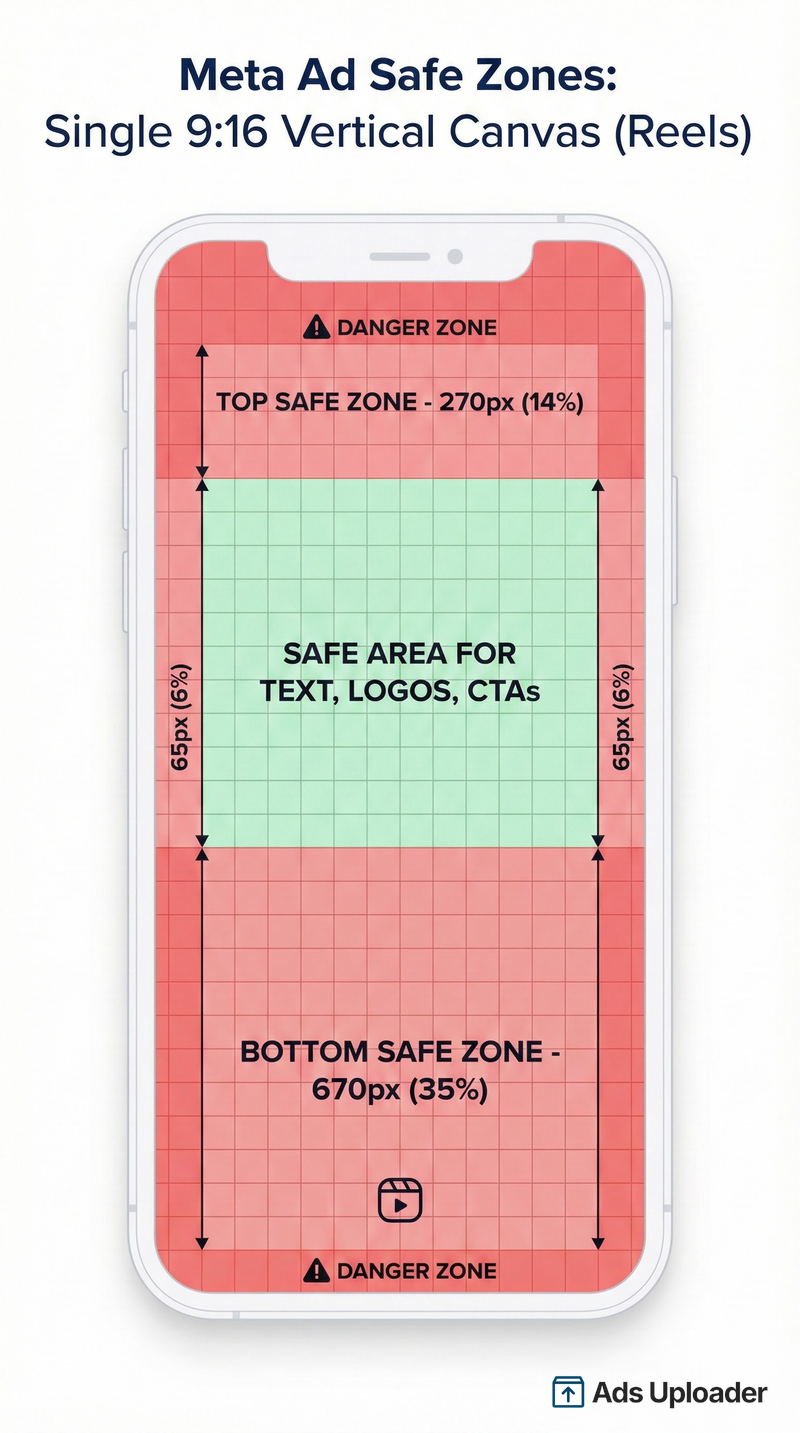
Reels (9:16 Vertical), The Critical Difference
Dimensions: 1080×1920px
Safe zones:
- Top: 270px (14%), same as Stories
- Bottom: 670px (35%), significantly more than Stories
- Sides: 65px (6%) each
This is where most advertisers make mistakes. Reels and Stories have the same dimensions, but Reels requires a much larger bottom safe zone.
Why 35% instead of 20%? Reels has more interactive elements stacked at the bottom: likes, comments, share button, audio information, and creator caption. All of this sits on the right side and bottom of your creative. If you design for Stories' 20% bottom margin and run on Reels, your CTA will be hidden.
The difference between 380px (Stories) and 670px (Reels) is nearly 300 pixels of additional danger zone. That's enough to completely obscure a headline or call-to-action.
Launch More. Click Less.
Upload hundreds of creatives at once, auto-match thumbnails to videos, and export directly to Meta Ads Manager.
Try Ads Uploader FreeNo credit card required • 7-day free trial
Horizontal/Landscape (16:9)
Dimensions: 1200×628px
Safe zone: Keep content within the middle 80%, approximately 60px from top and bottom, 120px from sides.
Horizontal format appears in link previews, desktop right column ads, and some in-stream placements. It's less common for primary creative but still requires attention to safe zones, especially for text-heavy designs.
Complete Safe Zone Reference Table
| Placement | Size (px) | Aspect Ratio | Top Safe | Bottom Safe | Sides |
|---|---|---|---|---|---|
| Feed Square | 1080×1080 | 1:1 | 100px | 100px | 100px |
| Feed Vertical | 1080×1350 | 4:5 | 250px | 250px | 100px |
| Stories | 1080×1920 | 9:16 | 270px (14%) | 380px (20%) | 65px (6%) |
| Reels | 1080×1920 | 9:16 | 270px (14%) | 670px (35%) | 65px (6%) |
| Horizontal | 1200×628 | 16:9 | 60px | 60px | 120px |
The "One Creative for All Placements" Strategy
There's a workflow that experienced media buyers use to simplify safe zone compliance across all placements: design one 9:16 vertical creative with all critical content confined to a center square.
Here's how it works:
- Start with 9:16 (1080×1920) as your master canvas
- Define a center 1:1 square (roughly 1080×1080 in the vertical center)
- Keep all text, logos, and CTAs within that center square
- Add a small carve-out on the right side for Reels buttons
When you upload this creative, Meta will display the full 9:16 for Stories and Reels. For feed placements, it crops to 1:1 or 4:5 from the center, and because your critical content is in the center square, it remains visible.
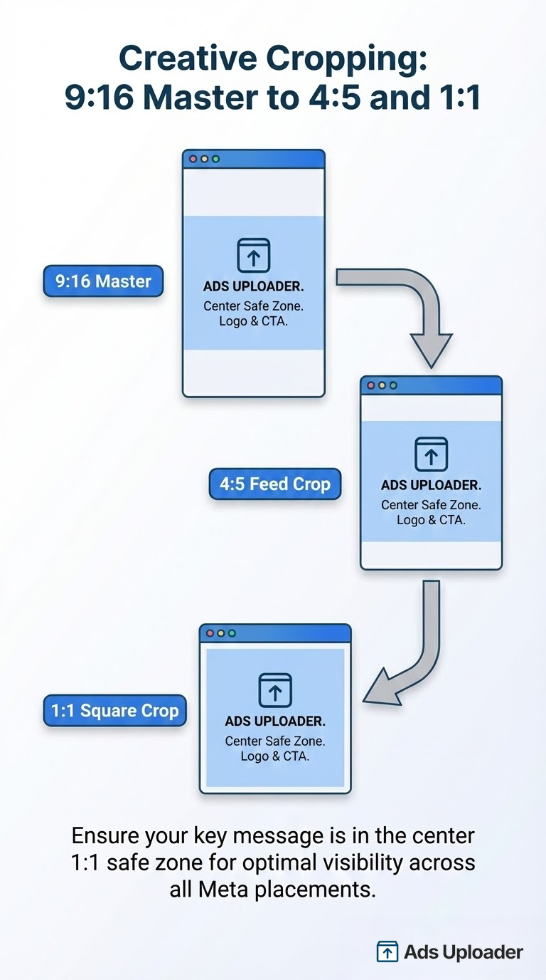
This approach was popularized by Jon Loomer and works well for advertisers who want to minimize production time while maintaining safe zone compliance.
Pros: Less production time, consistent messaging across placements, automatic safe zone compliance for most placements.
Cons: Less optimization per placement, may feel visually constrained, doesn't maximize available creative space.
For high-volume creative testing, this strategy reduces the risk of safe zone errors across dozens of variations.
How to Use Safe Zone Guardrail in Ads Manager
Meta provides a built-in tool to verify safe zones before you launch. Here's how to use it:
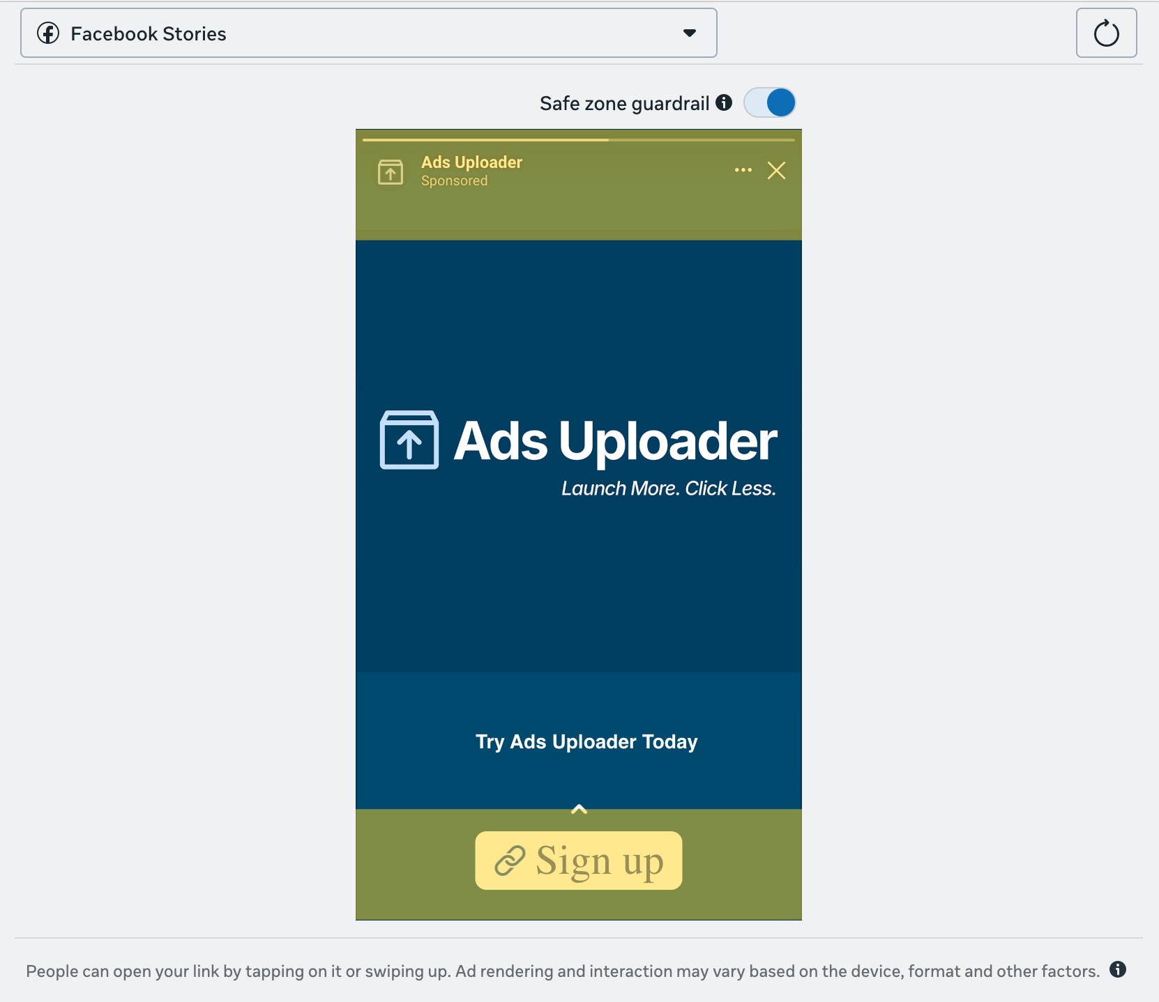
Step-by-Step Workflow
- Create or upload your ad creative in Ads Manager
- Navigate to the ad preview section
- Click "Edit" on your media asset
- Look for the "Safe Zone Guardrail" toggle
- Turn it on, a yellow overlay appears showing danger zones
- Review your creative, if any text or logos fall within the yellow area, they may be obscured
- Adjust your creative positioning if needed
- Preview across all placements before launching
What the Guardrail Shows You
The yellow overlay indicates areas where Meta's UI elements will appear. Content within the yellow zone may be:
- Completely hidden by buttons or icons
- Partially obscured by overlapping elements
- Difficult to read due to visual interference
The clear areas are safe for text, logos, and CTAs.
Important: The Guardrail shows you what happens on standard placements. Always use the advanced preview to check how your ad appears across Facebook Feed, Instagram Feed, Stories, Reels, and other placements before launching.
Safe Zones for Bulk Creative Uploads
The Scale Challenge
When you're uploading 10, 20, or 50 creative variations at once, manually checking Safe Zone Guardrail for each one isn't practical. You need a systematic approach that builds safe zone compliance into your workflow from the start.
Best Practices for Bulk Uploads
- Design all creatives with safe zones baked in, use templates with pre-defined safe areas so every variation is compliant by default
- Create aspect ratio variations from a single source, start with your 9:16 master, then export 4:5 and 1:1 crops from the same design
- Use the "one creative" strategy for maximum efficiency, center-weighted designs translate cleanly across placements
- Batch preview before final upload, spot-check a sample from each variation type across all placements
- Use aspect ratio variation features to maintain consistency when uploading multiple formats
Template Approach
The most reliable method for bulk creative is building safe zones into your templates:
- Create a master template at 1080×1920 (9:16)
- Add guide layers marking the safe zones for both Stories (20% bottom) and Reels (35% bottom)
- Design all content within the Reels-safe area (the more restrictive zone)
- Export variations (4:5, 1:1) by cropping from the center
- All variations automatically inherit safe zone compliance
This takes 30 minutes to set up once and saves hours of troubleshooting across hundreds of creative launches.
Save Hours on Creative Testing
Stop uploading ads one by one. Bulk process unlimited creatives with automatic media matching and direct API publishing.
Try Ads Uploader FreeNo credit card required • 7-day free trial
Common Safe Zone Mistakes to Avoid
1. Treating Stories and Reels the Same
This is the most common mistake. Stories need 20% bottom clearance. Reels need 35%. Designing for Stories and running on Reels means your bottom content gets buried under likes, comments, and captions.
2. Forgetting Side Margins
The 6% side margins on 9:16 formats are easy to overlook. Text that runs edge-to-edge looks fine in your design tool but gets clipped or cramped against UI elements on mobile.
3. Placing CTAs at the Bottom
It's intuitive to put your call-to-action at the bottom of a vertical creative. It's also wrong for Stories and Reels, where Meta places its own CTA buttons in that exact location. Move your CTA to the center or upper-center.
4. Ignoring Automatic Placements
When you enable Advantage+ placements, Meta shows your ad across all compatible placements. A creative designed for Feed will get cropped and displayed on Stories and Reels. This is especially important for carousel ads, where each card must respect safe zones independently. If you haven't considered those safe zones, parts of your message will be hidden. The Advantage+ creative enhancements you switch on compound this, since image expansion, overlays, and added text can shift elements into unsafe areas, so check them against the guardrail before launching.
5. Using Tiny Text Near Edges
Small text near the edges of your creative is at highest risk. It either gets clipped entirely or becomes unreadable when it competes with UI elements. Keep body text well within safe zones and use larger fonts for anything near boundaries.
6. Not Previewing All Placements
What looks perfect in Feed might fail in Reels. Always use Ads Manager's placement preview to see exactly how your creative appears across every placement before launching.
Frequently Asked Questions
What is the safe zone for Meta ads?
The safe zone is the area within your ad creative where text, logos, and CTAs won't be covered by platform UI elements like buttons and profile icons. Safe zones vary by placement, feed ads need about 100px margin from edges, Stories need 14% top and 20% bottom clearance, and Reels need 14% top and 35% bottom clearance.
What are the Instagram Reels safe zone dimensions?
For Instagram Reels at 1080×1920px, keep content away from the top 270px (14%), bottom 670px (35%), and 65px (6%) on each side. The bottom safe zone for Reels is significantly larger than Stories because of additional interactive elements like likes, comments, and audio information.
How do I check safe zones in Ads Manager?
In Ads Manager, go to your ad preview and click "Edit" on your media. Toggle on the "Safe Zone Guardrail" to see a yellow overlay showing areas that may be covered by UI elements. Adjust your creative so all critical content falls outside the yellow zone.
Can I use one creative for all Meta placements?
Yes. Create a 9:16 vertical creative with all critical content in the center square (1:1 area). When Meta crops for feed placements, your content stays visible. This "one creative" approach reduces production time and ensures safe zone compliance, though it sacrifices some placement-specific optimization.
What's the difference between Stories and Reels safe zones?
The main difference is the bottom margin. Stories need 20% (380px) clear at the bottom for the CTA button. Reels need 35% (670px) because of additional UI elements: likes, comments, share buttons, and creator captions. Designing for Stories and running on Reels will result in hidden content.
Do I need different creatives for Facebook and Instagram?
Not necessarily for safe zones, Facebook and Instagram use the same safe zone dimensions for equivalent placements (Stories, Reels, Feed). However, if you're optimizing creative for platform-specific audiences, you might want different messaging or visuals even though the safe zone requirements are identical.
Download Free Safe Zone Templates
We've created transparent PNG overlay templates for each major placement. Drop them into Photoshop, Figma, Canva, or any design tool to see exactly where your safe zones are while designing.
Download Safe Zone Templates (ZIP)
Available templates:
- 9:16 Stories (1080×1920), with 14% top and 20% bottom markers
- 9:16 Reels (1080×1920), with 14% top and 35% bottom markers
- 4:5 Feed Vertical (1080×1350), with 250px margins
- 1:1 Feed Square (1080×1080), with 100px margins
- 16:9 Horizontal (1200×628), with edge margins
Each template includes both light and dark versions so you can see the overlay against any background.
Conclusion
Meta ads safe zones aren't complicated once you know the dimensions. The key points:
- Feed ads (1:1, 4:5): 100-250px margins from edges
- Stories: 14% top, 20% bottom, 6% sides
- Reels: 14% top, 35% bottom, 6% sides, the bottom zone is nearly twice as large as Stories
- Use Safe Zone Guardrail in Ads Manager to verify before launching
- Build safe zones into templates for bulk creative uploads
The most common mistake is treating Stories and Reels the same. They're not. Reels requires 670px of bottom clearance versus Stories' 380px. Get this wrong and your CTA disappears under Meta's UI.
For advertisers testing creative at volume, the "one creative" approach, 9:16 with content centered in a 1:1 safe zone, reduces errors across all placements. Combined with safe zone templates, you can launch dozens of variations confident that your message will actually be visible.
Download the free templates above and start designing within the safe zones from your next campaign.
