Facebook ad examples are real ads running on Facebook and Instagram, studied for how their creative and offer are built rather than copied outright. They span four core formats: single image, video, carousel, and collection. The Meta Ad Library is the public source of live ones, exposing each ad's creative, copy, call-to-action, start date, and platforms, but never its spend, impressions, or conversion rate. Because performance is hidden, the value is in adapting the patterns that recur across strong advertisers, not in cloning any single ad.
Most Facebook ad swipe files are quietly dead. The screenshots are from 2017, the "high-converting" examples stopped running years ago, and half the galleries show recreations that never touched a real auction. You cannot verify a single claim in them, which is a strange way to learn from ads whose entire point was to run in public.
This roundup does the opposite. Every example below is a real ad pulled from the Meta Ad Library on 8 September 2026, shown as its genuine creative, and each carries its Library ID so you can open it and confirm it is running. The honest part comes with it: the library shows the creative and the offer, never the results, so read these as construction, not scoreboard. This page covers the formats, thirteen real ads across every major objective, how to find your own, and what these advertisers get away with that you cannot.
What Makes a Facebook Ad Work: The 5-Part Anatomy
Before the examples, the frame. Almost every Facebook ad is five parts, and a good ad lines all five up toward the same job.
- The hook creative. The image or video that stops the scroll and frames the offer visually.
- The primary text. The line above the creative. What matters is the first sentence, because the feed truncates the rest behind "See more."
- The offer. The actual reason to act: a discount, a free box, a quote, a free trial, a rate. No offer, no ad.
- The call-to-action button. Shop Now, Sign Up, Learn More, See Details, Install Now. The wording shapes the intent of the click.
- The destination. Where the click lands: an external page, an on-Facebook instant form, or a mobile app store. The destination decides what happens after the tap.
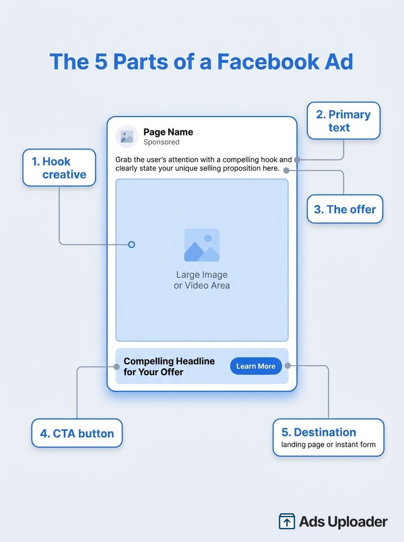
Two parts are worth extra attention. Put the offer in that first line of primary text, before the truncation point, because most people never expand it. And there is a sixth thing the anatomy cannot show you: performance. The Ad Library exposes all five visible parts of any ad, but never how it did. Keep that in mind every time an example looks impressive.
Facebook Ad Formats in 2026
The taxonomy gets muddled because Meta keeps four things in play that are not the same kind of thing: formats, placements, delivery systems, and destinations. Sort them out and the examples make sense.
The four core formats are single image, video, carousel, and collection. That is the safe, current set. A slideshow is a way to build a video from stills, not a separate format, and Canvas was renamed Instant Experience back in 2018, so it is a full-screen destination rather than a fifth media type. During a staged 2026 rollout, some accounts now set up Collection and Flexible presentations through "Format Display Options" instead of a top-level radio button, so do not be surprised if the setup screen looks different from an older tutorial.
Placements are not formats. Reels and Stories describe where an ad appears, not what it is. A Reels placement can receive video, image, or eligible carousel creative. You pick placements at the ad-set level and upload creative at the ad level, and Meta recommends placement-native 9:16 video for Reels. Placement also drives sizing.
Delivery systems sit on top of formats. Dynamic Creative mixes your assets into combinations, Flexible presentation lets Meta choose the layout, and Advantage+ creative applies enhancements like aspect-ratio adjustment or generative expansion. None of them is an image, a video, or a carousel; they are machinery that operates on those formats.
Catalog is its own layer. A catalog is the product data source. Advantage+ catalog ads, long known as Dynamic Product Ads, select products from that catalog per person and can render as single image, carousel, or collection. So "collection" and "catalog" are not synonyms.
| Format | What it is | Best for | Example below |
|---|---|---|---|
| Single image | One static visual, headline, CTA | One clean product or offer | The Ridge, Duolingo |
| Video | One video asset, often 9:16 | Persuasion, demonstration, UGC | HelloFresh, Paperlike, Notion |
| Carousel | Swipeable cards, each with own media and link | A range, a story, variants | Ridge wallets |
| Collection / catalog | Cover plus product tiles from a feed | Commerce at SKU scale | Wayfair |
| Instant form | On-Facebook lead capture (a destination) | Local and B2B lead-gen | K the Mortgage Agent |
The examples that follow are organized by these formats and objectives, because that is how you will actually choose one for your own campaign.
E-Commerce and DTC Facebook Ad Examples
Direct-to-consumer brands are the most-studied Facebook ad examples for a reason: they run high volume, rotate fast, and their offers are legible. Here are three from the same corner of retail, each a different commerce format.
Every ad in this section is built on the Sales objective; our roundup of conversion ad examples goes deeper on purchase-optimized creative.
The Ridge: The Single-Image Product Ad
The purest commerce format. One benefit line as the primary text ("5 in 1 Power Bank - get 10,000mAh in the palm of your hand"), the positioning pushed into the headline and link area ("The Most Versatile Power Bank"), and a Shop Now button. No split panels, no clutter. The product and a single claim carry the whole ad.

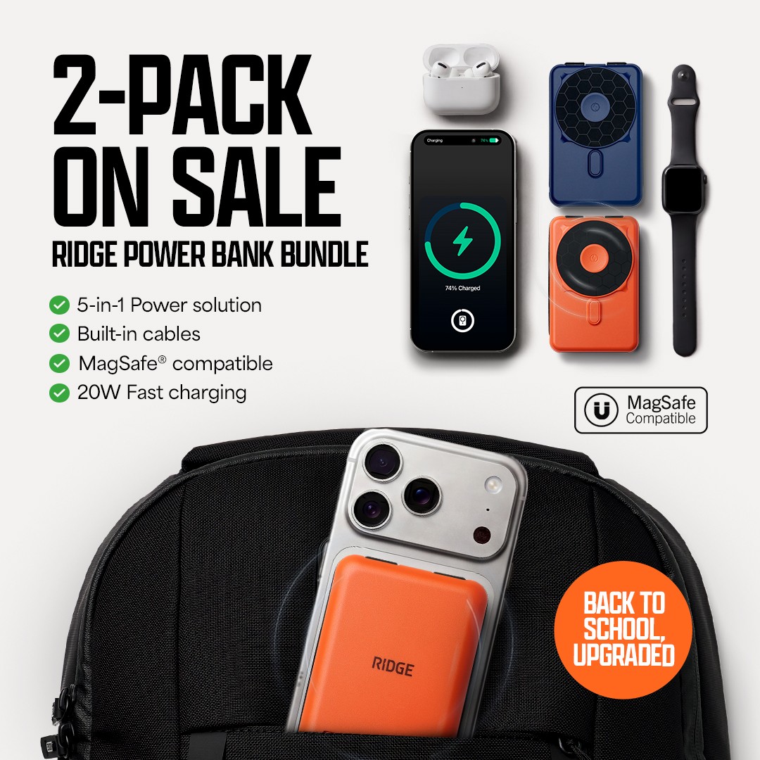
What to take from it: a single-image ad works when the product is visually self-explanatory and the offer fits one line. The Ridge also leans on a third-party endorsement, building the creative and landing page around the tech reviewer MKBHD ("Tech's toughest critic approved it"), so the ad borrows credibility the product shot itself never has to argue.
The Ridge Wallets: The Variant Carousel
Same brand, different job. This one is a carousel of a single product, the metal wallet, across its materials and finishes. One shared primary text runs above all cards ("Upgrade your wallet to Ridge. Metal, RFID-blocking wallets designed to carry cards and cash safely and securely"), and each card deep-links to a finish. The row reads as one product in a lineup of colorways rather than six unrelated items.

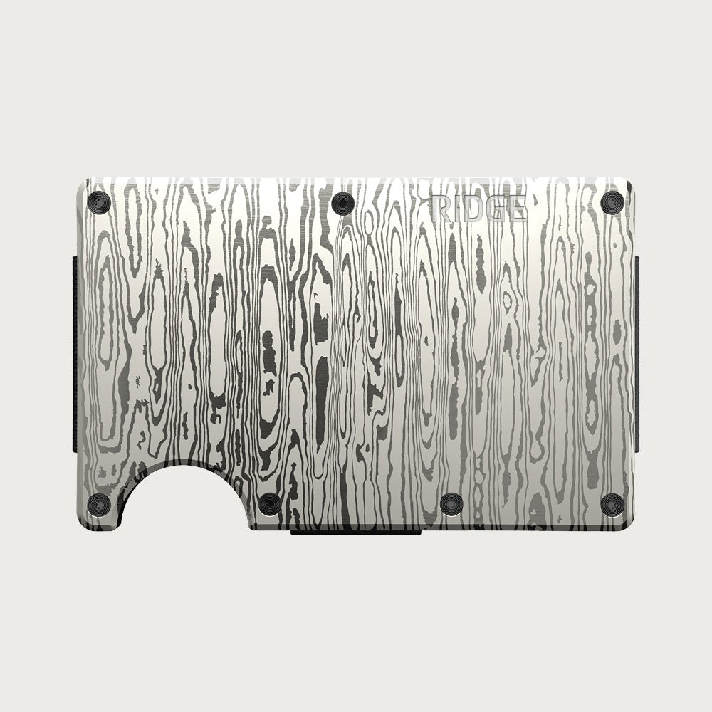
What to take from it: a carousel earns its place when the swipe adds information. Showing finishes, angles, or a step sequence gives the viewer a reason to interact; padding a carousel with near-identical cards does not. This is a hand-curated carousel, which is worth separating from the catalog pattern in the next example.
Wayfair: The Catalog (Dynamic Product) Ad
This looks like an ordinary furniture ad, but it is built by a machine. It is a catalog ad: products pulled dynamically from Wayfair's feed, the lead card here a tan leather L-shaped sectional carrying its own price straight from the catalog ("From $1,830"). One generic primary text sits on top ("Furniture that passed our 10-point quality inspection"), and the destination is that product's page, tagged for retargeting. Show it to a different viewer and the SKU changes.


What to take from it: the Ridge wallets carousel and this Wayfair ad can report the same swipeable layout, yet they are different machines. Ridge's is a curated set of one product's finishes; Wayfair's is a dynamic feed choosing products per viewer, with per-SKU prices and retargeting tags. If you run a store with more than a handful of products, the catalog build is what scales.
Video and Creator Facebook Ad Examples
Video is the persuasion format, and the strongest current version of it is the creator partnership ad, where a brand runs an ad through a creator's own page.
HelloFresh: The Creator Partnership Video
The ad runs on the creator's page (Deddeh Howard) as branded content for HelloFresh. The primary text is first-person ("I finally made my home cooking easy, thanks to HelloFresh. Plus, you get ten free meals"), the creative is a home-kitchen clip that looks shot on a phone rather than in a studio, and the headline carries a personal code, DEDDEH10MEALS, that doubles as the discount and the attribution. The offer, ten free meals, is the hook. Play it and the video opens on the creator unboxing the delivery straight after a trip.

What to take from it: this is what the industry loosely calls "UGC," but UGC is a creative style, not a format or a guarantee. The real mechanism here is the partnership ad, and it is mainstream now, run by DTC subscription brands and big-box retailers alike. Meta's own June 2025 experiment across roughly 2,400 advertisers found that adding partnership-ad creative to business-as-usual ads averaged 19% lower cost per acquisition and 13% higher click-through rate, though Meta is explicit that results are not guaranteed. If you go this route, use Meta's Paid Partnership label and the formal permission workflow rather than sharing login credentials, and note the disclosure point in the compliance section below.
Testimonial and Social-Proof Facebook Ad Examples
Social proof is a pattern of its own: let customers make the claim you cannot make as confidently yourself. It shows up three ways here, a video review-stack, a static review-stack, and a local-service proof ad.
For more of this pattern, see our collection of testimonial Facebook ad examples across brands and formats.
Paperlike: The Video Review-Stack
Paperlike stacks the proof. The primary text runs three named, five-star customer quotes ("It feels like you're writing on actual paper" and more), then closes with the aggregate: "25,000+ more to read" and "over 9,000 backers" from its Kickstarter. The creative is a short skit video contrasting paper with the iPad, so the demonstration and the testimonials reinforce each other. It has been running since October 2025, which tells you the advertiser keeps choosing it, not that it is a proven winner.

What to take from it: the review-stack works because the quotes are specific and named, and the big number backs them up. Reuse a customer review in paid creative, though, and it becomes a testimonial you are legally responsible for, which is where the compliance section picks up.
Build Your Own Swipe File
Stop scrolling the Ad Library by hand. Search, filter, and save proven ads with a free Chrome extension built for media buyers.
Get Ad Library Helper FreeFree Chrome extension • Built by Ads Uploader
Loopy Cases: Proof in the Copy, Not the Creative
A cleaner, quieter version of social proof, and a useful contrast. The creative is a bright poolside lifestyle shot of the phone case, no stars on the image at all. The proof lives in the link description instead: "Rated the best case ... with over 60,000+ 5-star reviews." The primary text just sells the restock ("Dip into style with Blue Stripes").

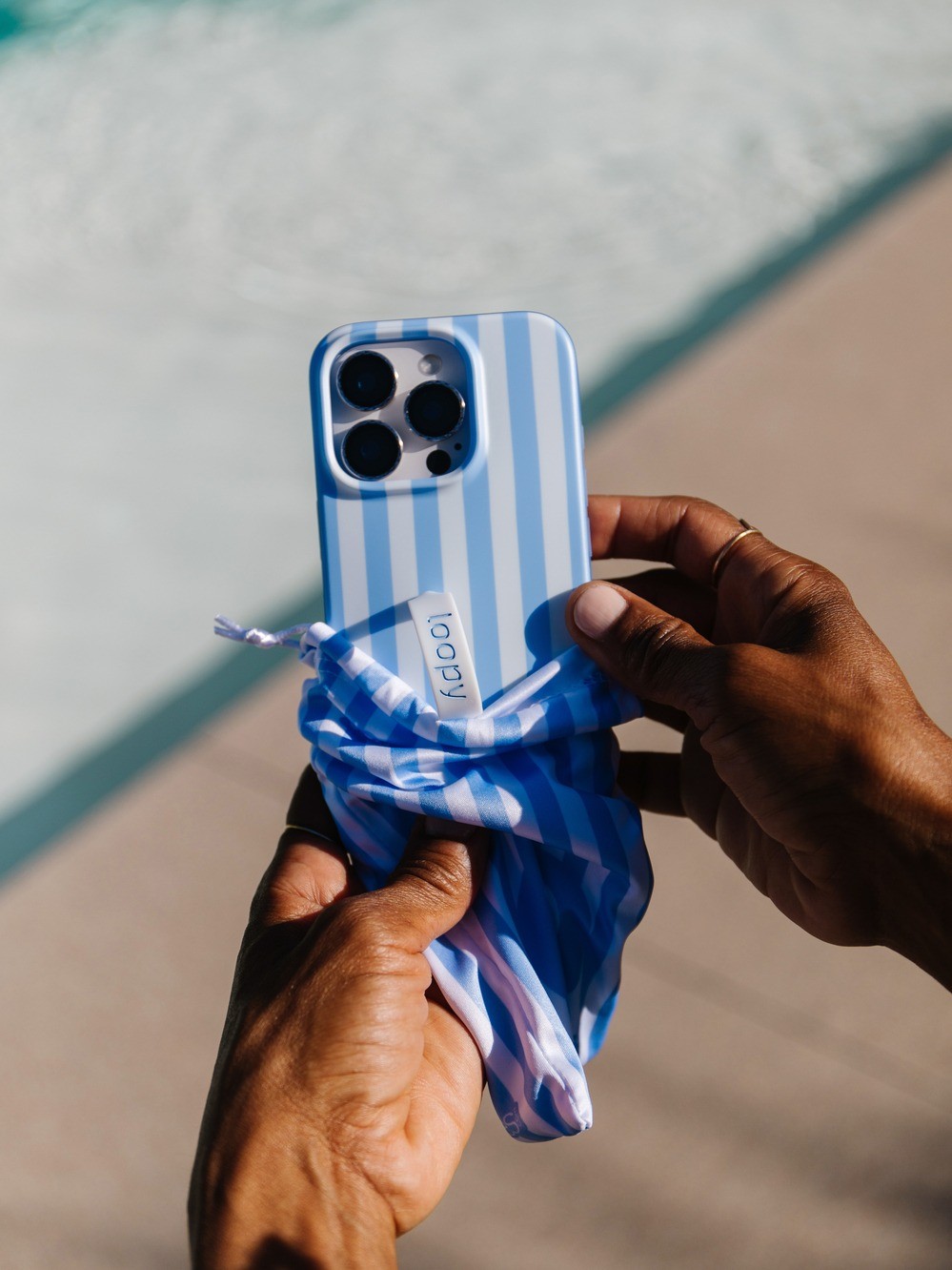
What to take from it: notice where the proof sits. Paperlike stacks full written reviews in the primary text above a skit video; Loopy Cases keeps a clean product image and puts a single review count in the link description. Both are valid, and the split is worth knowing, because a review count in the link description is easy to update and does not clutter a scroll-stopping image. The "+" on "60,000+" is still a claim you have to be able to stand behind.
Simply Green Pest Control: The Local-Service Proof Ad
The small-business version, and a lesson in matching the creative to the fear. The image is simply a scorpion on a desert rock. The offer and the proof are in the text: "Mention Facebook and Receive 50% Off Your Initial Service. Family/Locally Owned, Over 500 5 Star Reviews Online, Green Products, Guaranteed Results!" It has been running since 2019.
The same local, community-first playbook drives our church Facebook ad examples, where non-commercial pages invite before they sell.


What to take from it: a local service does not need a polished studio creative. The scorpion is the hook because it is the problem, the "500 5 Star Reviews" is the trust, and "Mention Facebook and Receive 50% Off" is both an offer and a crude attribution mechanism. A seven-year run says the formula keeps working for them, not that it beat a target you can see.
Lead-Generation Facebook Ad Examples
Lead-gen is where the destination becomes the story. Instead of a website, the click opens a form inside Facebook.
One vertical leans on this harder than any other; our solar Facebook ad examples shows the qualifying-question pattern running across nearly every ad.
K the Mortgage Agent: The Local Instant-Form Ad
A genuinely small advertiser (318 Page likes) running a textbook local-service lead ad. The hook is a rate ("Commercial Mortgage Rates from just 3.53%"), the creative is a text-forward image built around that number, and the primary text lists the property types served before dropping the agent's license number and direct phone. The click opens an on-Facebook instant form. You can spot the instant form from the outside, because the ad points to an fb.me link rather than an external domain.

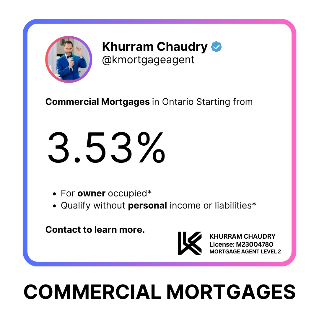
What to take from it: instant forms strip friction, which is their whole value, but that is also the lever on lead quality. Meta's own lead-gen guidance points to instant forms lowering cost per lead versus website forms, not to forms always winning; a website form is the better call when you need heavy qualification or scheduling. Where you want fewer, better leads, add a qualifying question before the contact fields.
B2B, SaaS and App-Install Facebook Ad Examples
Five patterns round out the hub: the SaaS free-trial ad, the SaaS feature video, the B2B automation ad, and the two shapes of app install.
monday.com: The SaaS Free-Trial Ad
The SaaS pattern in one ad: a free-account CTA and a customer-count proof point ("There's a reason why 225K+ customers use monday.com to efficiently manage their teams, work and processes. See why"). The offer is the free account itself, and the social proof does the persuading.

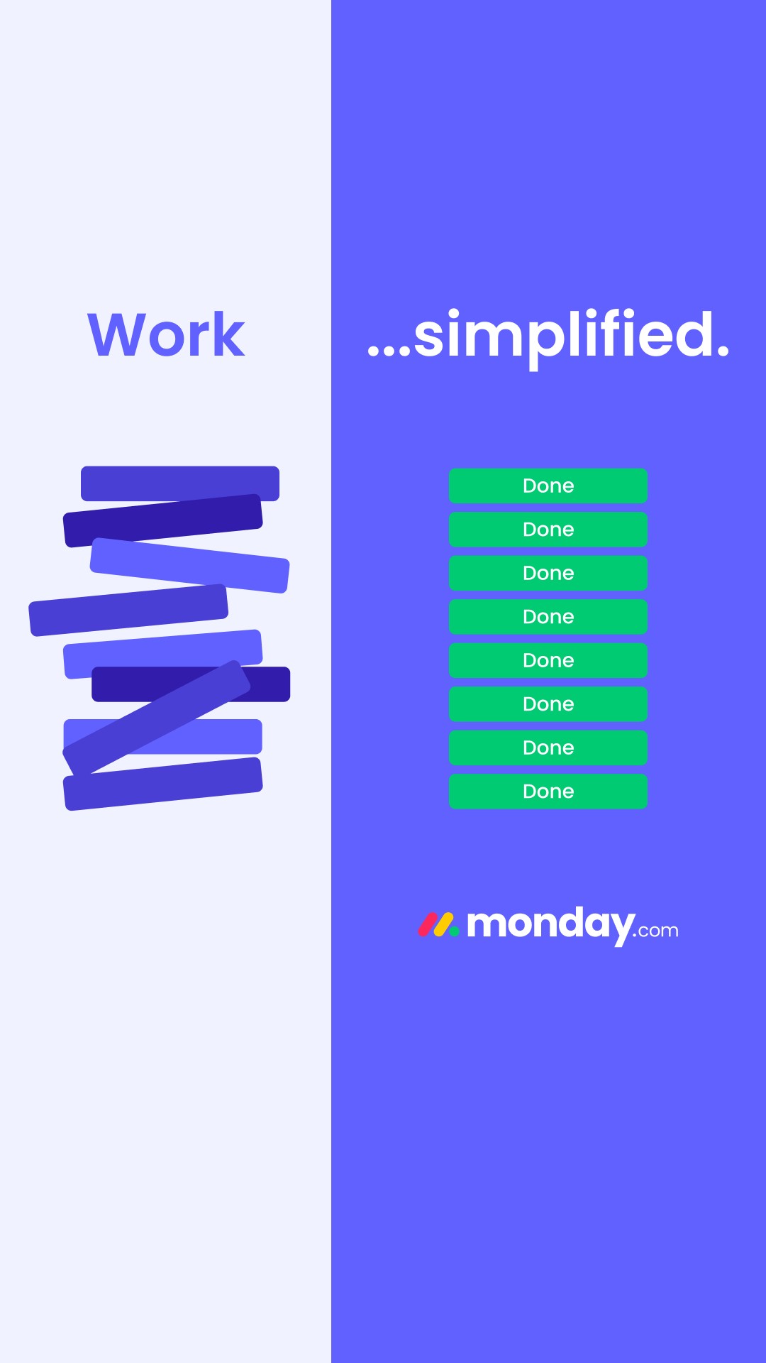
What to take from it: pair a free-tier offer with a specific, verifiable number. That "225K+ customers" is not decoration; it is an objective claim you have to be able to substantiate, which is exactly the kind of line the compliance section is about.
Notion: The SaaS Feature Video
The same category, a different creative gear. Instead of a proof number, Notion leads with the feature it wants to own this quarter: "Notion has everything you need to unlock the power of AI at work," followed by a benefit-tick list built around Custom AI Agents. The video is the demo, and the CTA is a plain Sign Up.

What to take from it: in B2B the interface and the feature are the hero, so a video that shows the product doing the new thing carries more than a slogan. Note the destination is an fb.me link, so this signup runs through an on-Facebook step rather than straight to the website.
Zapier: The B2B Automation Ad
The broad-appeal B2B version. No number, no demo, just a category promise: "Scalable automation for all," with a headline that spans the range of buyer ("Automate basic tasks + complex workflows") and a Learn More button for a considered purchase.

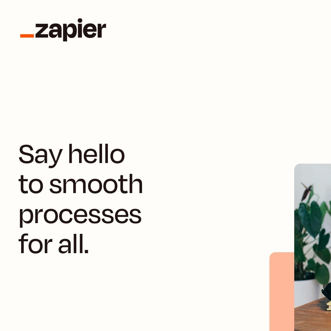
What to take from it: a Learn More CTA suits a product people research before they buy, and a headline that names both ends of the skill range ("basic tasks + complex workflows") lets one ad speak to a solo user and a team lead at once. The trade is that a soft CTA gathers lower-intent clicks, so the qualification has to happen on the landing page.
Duolingo: The App-Install Ad
App installs are their own objective. This ad is built for it: a plain free-tier offer ("Learn a language for free with fun lessons designed to keep you motivated"), an Install Now button, and a destination that is the Google Play listing rather than a website.

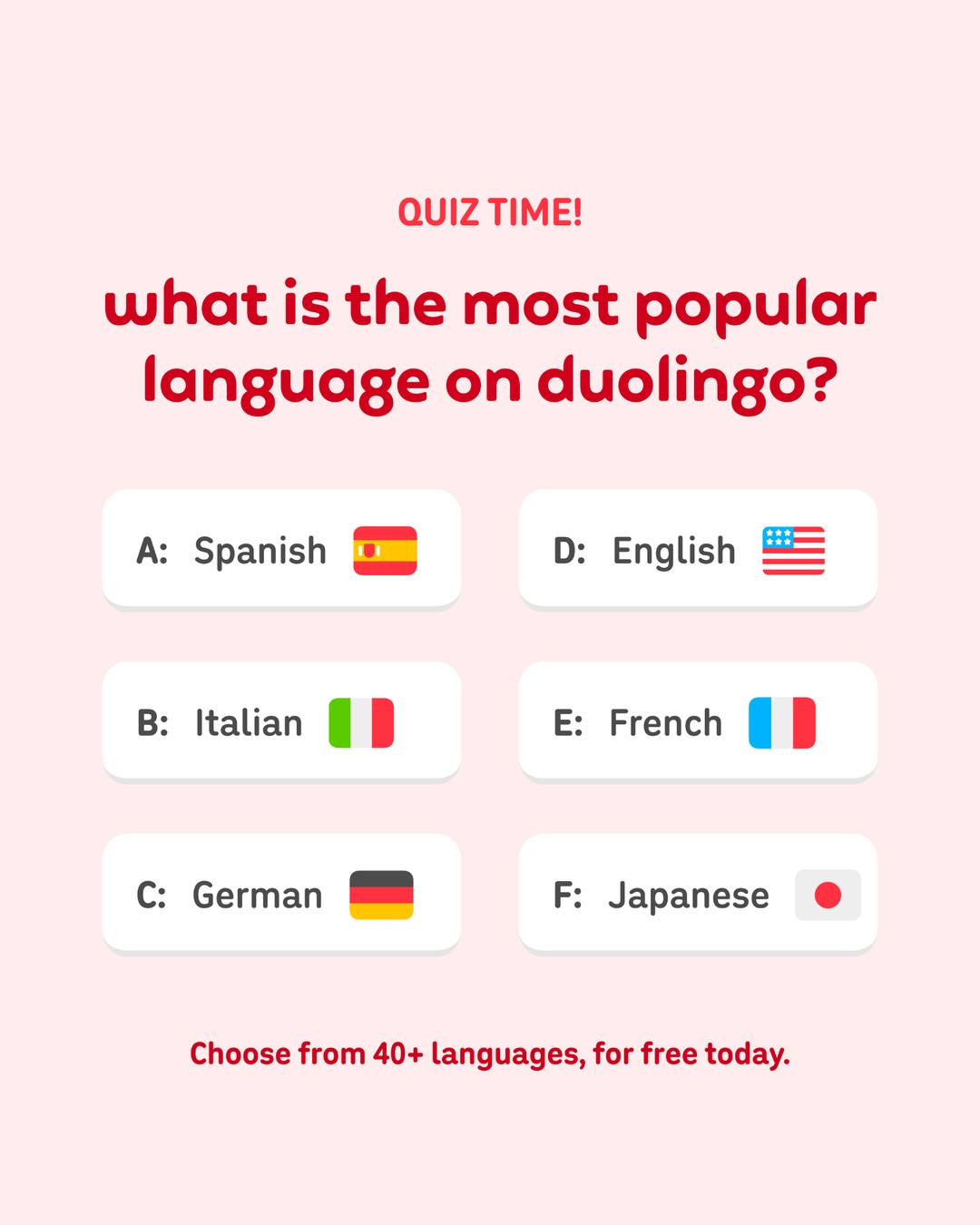
What to take from it: an app-install ad uses the App Promotion objective and sends people straight to a store listing. Under the hood, "Install Now" is a call-to-action, not the objective, and Audience Network in the placement set is typical for install campaigns. Keep the creative bright and instantly legible, because install ads compete in fast, low-attention placements.
Survivor.io: The App-Install Video
The same objective, the format that dominates mobile-game acquisition. The creative is a reaction-and-gameplay video, a streamer on top and the game running below, with a "Play game" CTA and a welcome-bonus hook. The destination is the App Store listing.

What to take from it: the reaction-plus-gameplay format is everywhere in mobile gaming because it shows the product in the first second and borrows a person's attention to frame it. The welcome bonus is the offer, "Play game" reads as lower commitment than "Install now," and the 9:16 build is native to the Reels and Stories placements where these compete.
Save Hours on Creative Testing
Stop uploading ads one by one. Bulk process unlimited creatives with automatic media matching and direct API publishing.
Try Ads Uploader FreeNo credit card required • 7-day free trial
How to Find Real Facebook Ad Examples in the Meta Ad Library
Every ad above came from one free tool, and you can build your own swipe file the same way. The Meta Ad Library is public, needs no login to browse, and shows every ad currently running across Facebook and Instagram.
- Open the library and set the country. The ordinary library is scoped to ads that are currently running, so pick the delivery market you care about and leave the type on All Ads.
- Search a Page or a keyword. Search an advertiser's Page name to see their whole active set, or a keyword to see who is bidding on an angle. Confirm you have the right Page before you draw conclusions.
- Filter down. Narrow by active status, date, platform, language, and media type where those controls appear, so you are studying the right slice.
- Record the Library ID and the construction. Save the Library ID, Page, start date, platforms, primary text, headline, CTA, and destination. These are facts about how the ad is built.
- Screenshot it, because it may vanish. An ordinary commercial ad is not guaranteed to stay in the library once it stops running, so save a dated capture for your own reference.
What you cannot get this way is performance, and that is the single most important thing to internalize. For a full walkthrough of search, filters, and the API, see our Meta Ads Library guide.
What These Ads Get Away With, and What You Can't
Reading examples has a trap: the ad ran, so it must be fine to copy. Not quite. Meta reviews the ad and its landing page together, and the FTC governs the claims regardless of what Meta approves. A few lines from the examples above are worth pulling out.
Social-proof numbers are claims, not decoration. monday.com's "225K+ customers," Paperlike's 25,000+ reviews, Loopy Cases' "60,000+ 5-star reviews" and Simply Green's "500 5 Star Reviews" are all objective, measurable claims. The FTC's substantiation standard expects a reasonable basis before you publish, so a count like that should be backed by a timestamped export with a clear definition of what you counted. The "+" only helps if the verified number really is at least that high.
Reused reviews become testimonials you own. The moment a customer review goes into paid creative, as in the Paperlike ad, it is a testimonial, and the FTC's 2024 Consumer Reviews and Testimonials Rule, in effect since 21 October 2024, authorizes civil penalties for fake or misleading ones. A generic "results may vary" does not rescue an exceptional testimonial; you have to be able to show the result is typical or disclose what is. The FTC's rule guidance spells out what crosses the line.
Creator ads need real disclosure. Meta's Paid Partnership label and permission workflow are the platform side, and the HelloFresh ad uses them. The FTC is separate, and its current guidance says a built-in platform label is not necessarily enough on its own if it is easy to miss. For a spoken endorsement in a video, disclose it clearly in the creative too.
Personal-attribute hooks get ads rejected. Meta's Personal Attributes policy prohibits copy that asserts or implies a viewer's sensitive attributes, which is why a finance or health hook works better as "a program for people managing debt" than "are you drowning in debt?"
None of this is a reason to be timid. It is a reason to build the claim and the substantiation together, the way the stronger advertisers above already do.
Frequently Asked Questions
Where Can I Find Real Facebook Ad Examples?
The Meta Ad Library at facebook.com/ads/library is the source of truth. Search an advertiser's Page name or a keyword, then filter by country, platform, date, and media type. You can read the creative, primary text, headline, CTA, and start date, and copy the Library ID for a shareable link. It does not show spend, impressions, or conversion rate for ordinary commercial ads, so treat what you find as evidence about creative and offer construction, not proof of results.
What Are the Main Types of Facebook Ads?
Four core formats carry almost everything: single image, video, carousel, and collection. Reels and Stories are placements (where an ad shows), not formats, and a Reels placement can receive video, image, or carousel creative. Dynamic Creative, Flexible presentation, and Advantage+ creative are systems that operate on those formats rather than being formats themselves. Advantage+ catalog ads pull products from a catalog and can render as single image, carousel, or collection.
What Makes a Good Facebook Ad?
A good ad lines up five parts: a hook creative, a first line of primary text that states the offer before it truncates, a valuable offer, a CTA that matches intent, and a destination that delivers what the ad promised. The creative should feel native to the placement. And the claim has to be one you can substantiate, because Meta reviews the ad and its landing page together, and the FTC expects a reasonable basis before you publish.
Can I Copy a Competitor's Facebook Ad?
Study it, do not clone it. Copy an ad wholesale and you inherit its constraints without its context. Spot the pattern that recurs across strong advertisers, then adapt the offer, angle, and format to your own brand. Cloning also carries risk: lifting another brand's copy, images, or reviews can breach Meta's policies, the FTC's testimonial rules, and intellectual-property law.
Can You See How Well a Facebook Ad Performed in the Ad Library?
No, not for ordinary commercial ads. The library documents creative, Page, delivery dates, and platforms, but not click-through rate, cost per click, spend, conversions, cost per lead, or return on ad spend. Spend and impression ranges are published only for political and social-issue ads, and estimated reach plus targeting are added for EU and UK delivery under regional rules. A long-running ad is likely important to the advertiser, but that is not proof it is a winner.
What Is the Best-Performing Facebook Ad Format?
There is no universal best format; the format follows the objective. Meta's own tests are scoped rather than universal: one meta-analysis found 9:16 video with audio delivered 34.5% lower cost per result than still-image Reels ads, but that compares creative inside the Reels placement, not video against every format everywhere. No credible source establishes a clean image-versus-video-versus-carousel winner across industries and offers, so test formats against your own objective.
How Do I Make My Own Facebook Ads Like These Examples?
Start from the objective, pick the format that expresses it, then adapt one of the patterns above to your offer. Write the hook and offer into the first line of primary text, make the creative native to the placement, and keep every claim substantiated. Then launch enough variations to actually learn something, because a single ad tells you almost nothing. Building each variation by hand in Ads Manager is the slow part, which is where a bulk workflow pays off.
The Short Version
The best Facebook ad examples are the ones you can verify are running, which is why every ad here is its genuine creative with a Meta Ad Library ID instead of a decade-old screenshot. Read them as construction and not scoreboard: the library shows the creative, the copy, the CTA, and the offer, but never the spend or the result, so a long-running ad tells you an advertiser keeps choosing it, not that it beat its targets.
The patterns are portable. A single image for a self-explanatory product, a carousel when the swipe adds information, a catalog feed once you have real SKU count, a creator video for trust, a review-stack for social proof, an instant form for local lead capture, a UI-forward creative and a free trial for SaaS, a soft CTA for a considered B2B purchase, and a bright, fast creative for app installs. Match the format to your objective, adapt the offer to your brand, and keep the claim honest, because Meta and the FTC both read the ad and the destination together.
Then do the part these Facebook ad examples cannot show you: test. Launch enough real variations to learn which hook, format, and offer actually move your numbers, and let your own results, not a swipe file, decide what wins.